Are these the 23 ugliest cars ever made?
Cartastrophes
Beauty is in the eye of the beholder, they say, but that doesn’t explain how a car can be brought to market that looks like it drove through the ugly forest, bouncing off every tree as it went.
When a car designer creates a baby that you’d have thought only they could love, it then has to be signed off by the head of design, and then other members of senior management, long before it finally is revealed to the public. This allows plenty of opportunity for a few nips and tucks. The result, usually, is a car that looks at least acceptable to most buyers.
Sometimes, though, a car design starts off pleasant and, through corporate bureaucracy, cost-saving, safety regulations or the simple matter of practicality, it can end up a turkey in showrooms.
Either way, sometimes a car is presented to us that looks so horrible that you want to pour bleach in your eyes. Here is our list of some of the ugliest cars ever built.
1. Fiat Multipla
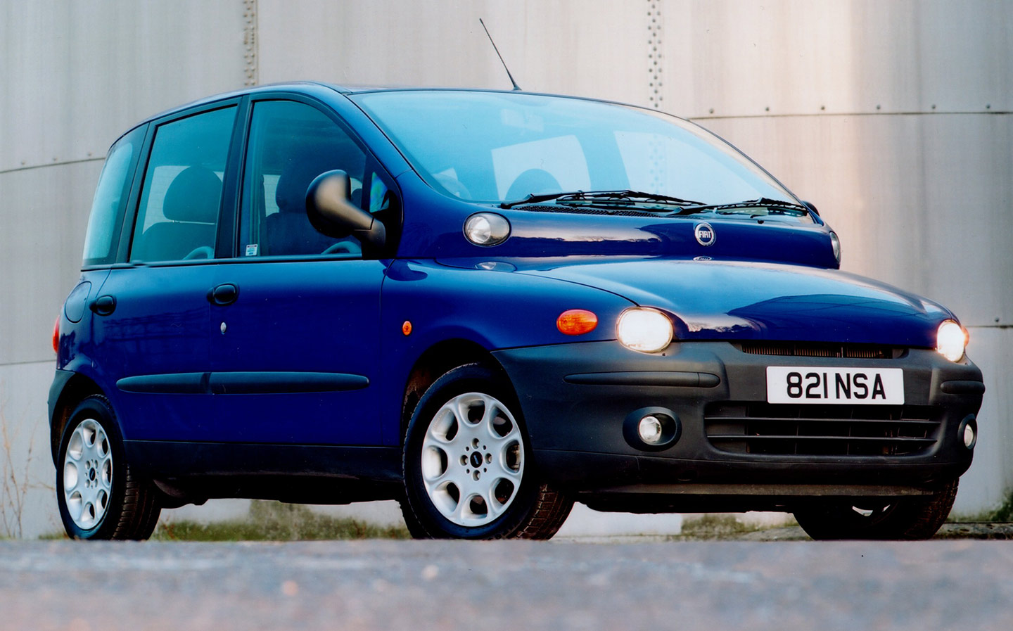
The tragedy of the Multipla is that its Elephant Man-esque exterior enclosed a genuinely clever and spacious interior — and it wasn’t bad to drive either. It’s a shame, then, that you’d rather walk than be seen in it.
2. Volkswagen Type 181 (aka Trekker / Thing)
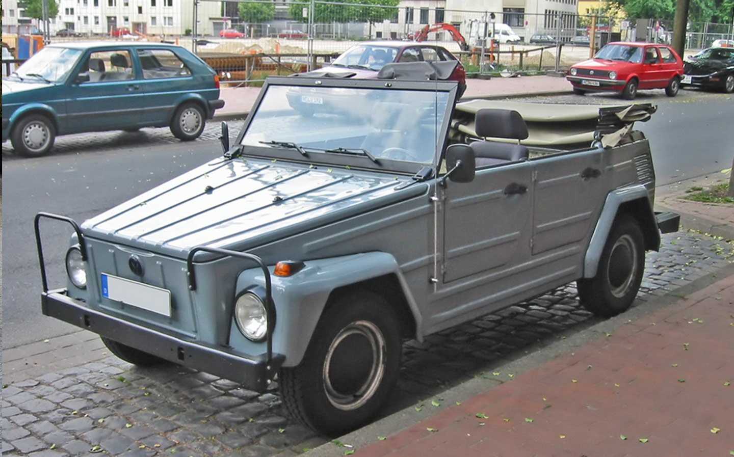
The VW Type 181 was designed for the German military in the late 1960s but sold to the public from 1980 under a number of names, including the Trekker in the UK and the Thing in America. Quite what the Germany army or anyone else needed with a Mini Moke-inspired biscuit tin is anyone’s guess. [Image credit: Sven Storbeck]
3. Nissan Cube
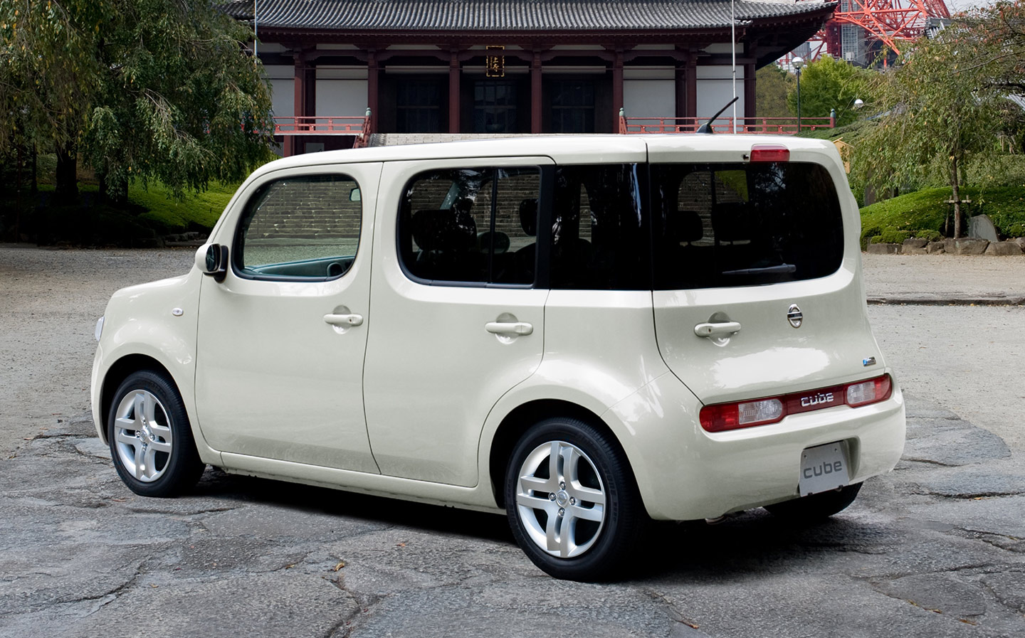
The Cube’s design does what it says on the tin — it’s like a box on wheels. It was quite practical for a small car, but the asymmetric rear is an acquired taste and put off a lot of potential buyers.
4. Cadillac Seville
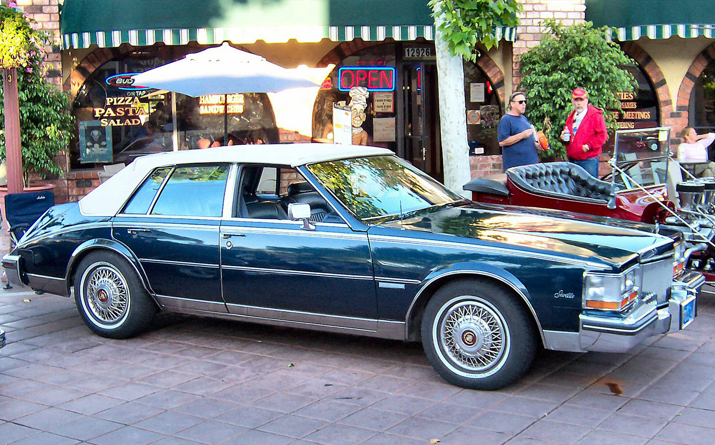
With the downward-sloping shoulder line it looks like the rear of the 1980 Seville has melted. It does grab the attention of some car collectors, though, and can sell for more than £10,000. [Image credit: Morven]
5. Sbarro Autobau concept
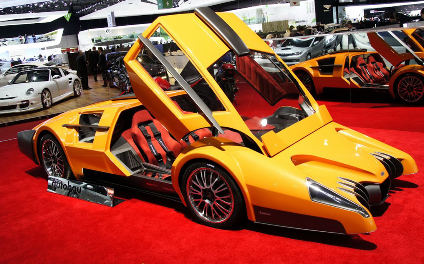
It’s as if Bruce Wayne, having spent the family fortune, was forced to create a Batmobile from a Bond Bug. Amazingly, this concept isn’t from the ’80s; it was revealed at the 2010 Geneva motor show.
While there was something special powering the wheels — a mid-mounted 12-cylinder unit from Ferrari — the Autobau only produced 500bhp, which isn’t much by today’s supercar standards.
6. Chrysler PT Cruiser
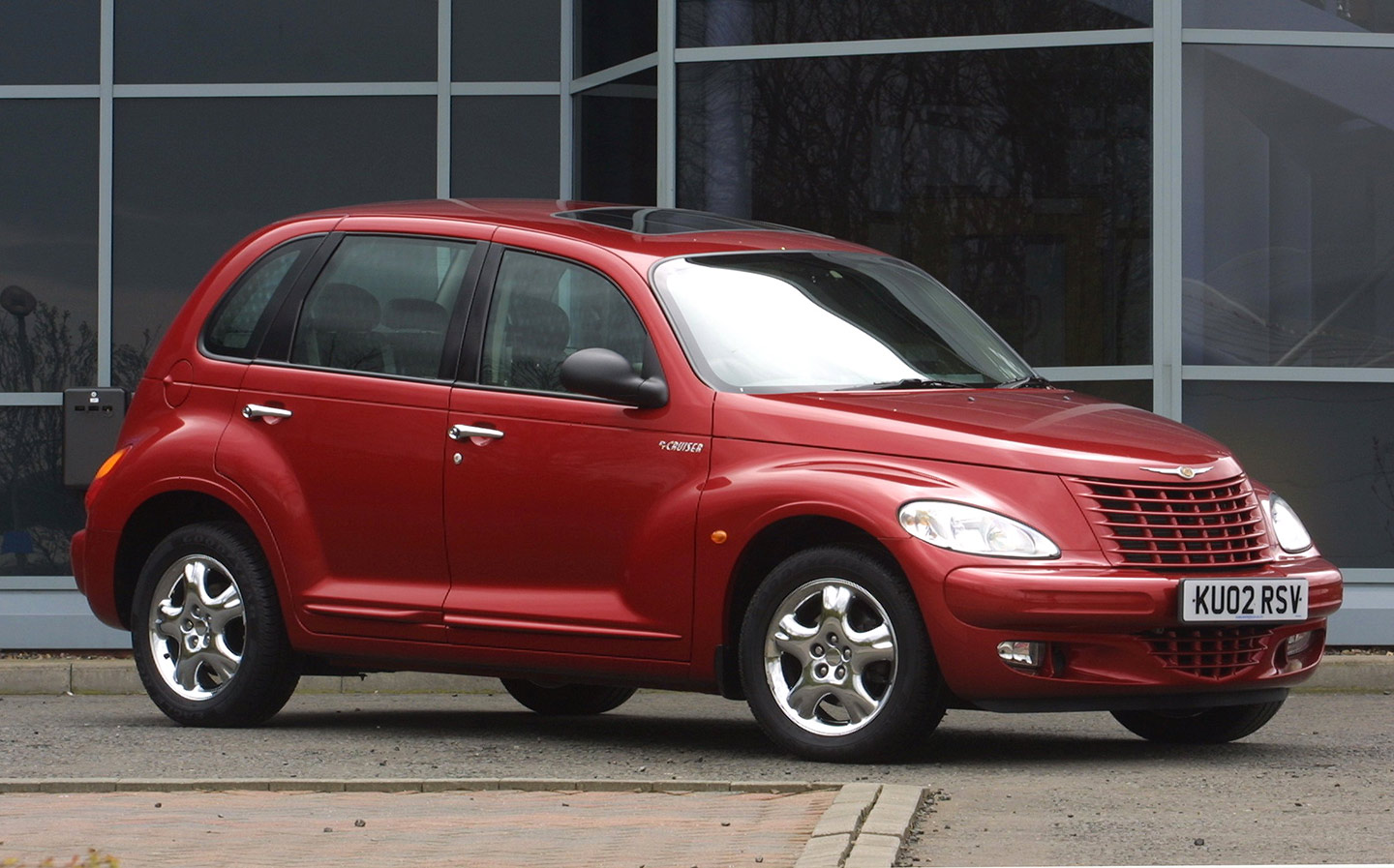
Like the Prowler below, from Chrysler-owned Plymouth, the PT Cruiser was an attempt to recapture some 1950s hot rod magic. It was a failed attempt, though, and the only magic you’d want is the ability to make it disappear.
7. Aston Martin Lagonda
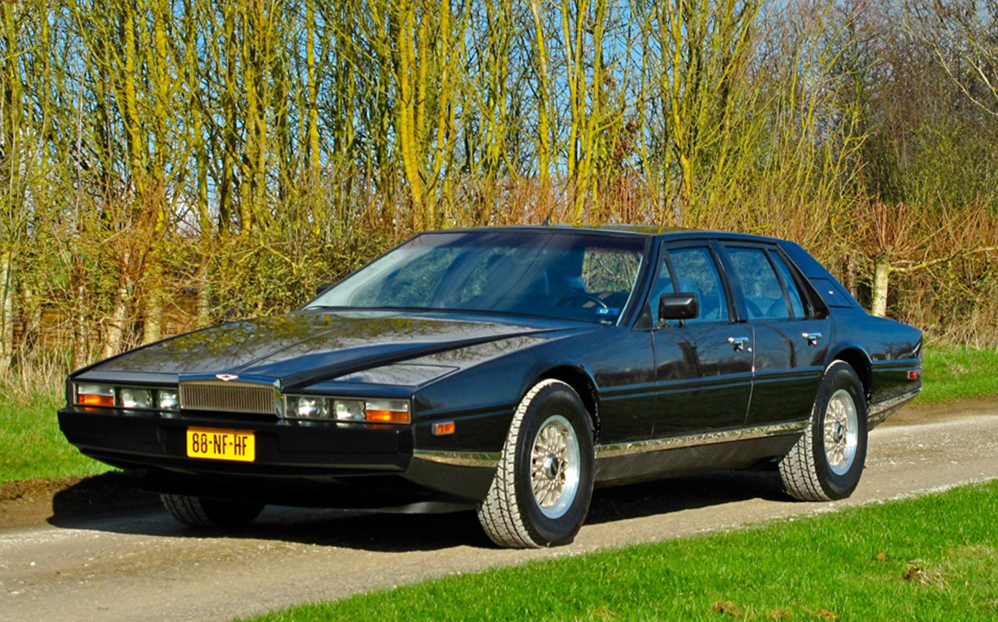
Now prized by collectors (they can fetch more than £100,000), the wedge-shaped Lagonda of the 1980s stands out as Aston Martin’s least attractive design by some margin. The minimalistic interior was extraordinarily futuristic, though, with a single-spoke wheel and digital instruments.
8. Nissan S-Cargo
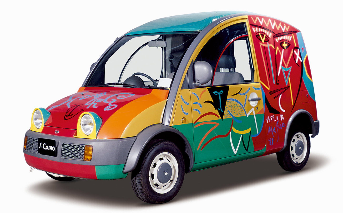
Like a less attractive van conversion of the Popemobile, the only thing that could make it worse is a tongue-in-cheek Picasso-inspired special edition with a humourless name. Step forward the Nissan S-Cargo.
9. Fiat 600 Multipla Marinella
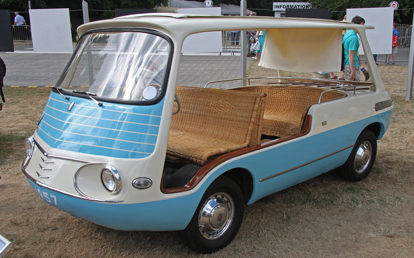
Poor Multipla… it’s a name without much dignity. The 1958 Fiat 600 Multipla Marinella could be considered cute but it’s more often described as better suited to an amusement park than public roads.
To our eyes, it resembles a shrunken milk float crossed with a Riva speed boat, and taking a moderately quick right-hander might be… interesting. [Image credit: Brian Snelson]
10. Plymouth Prowler
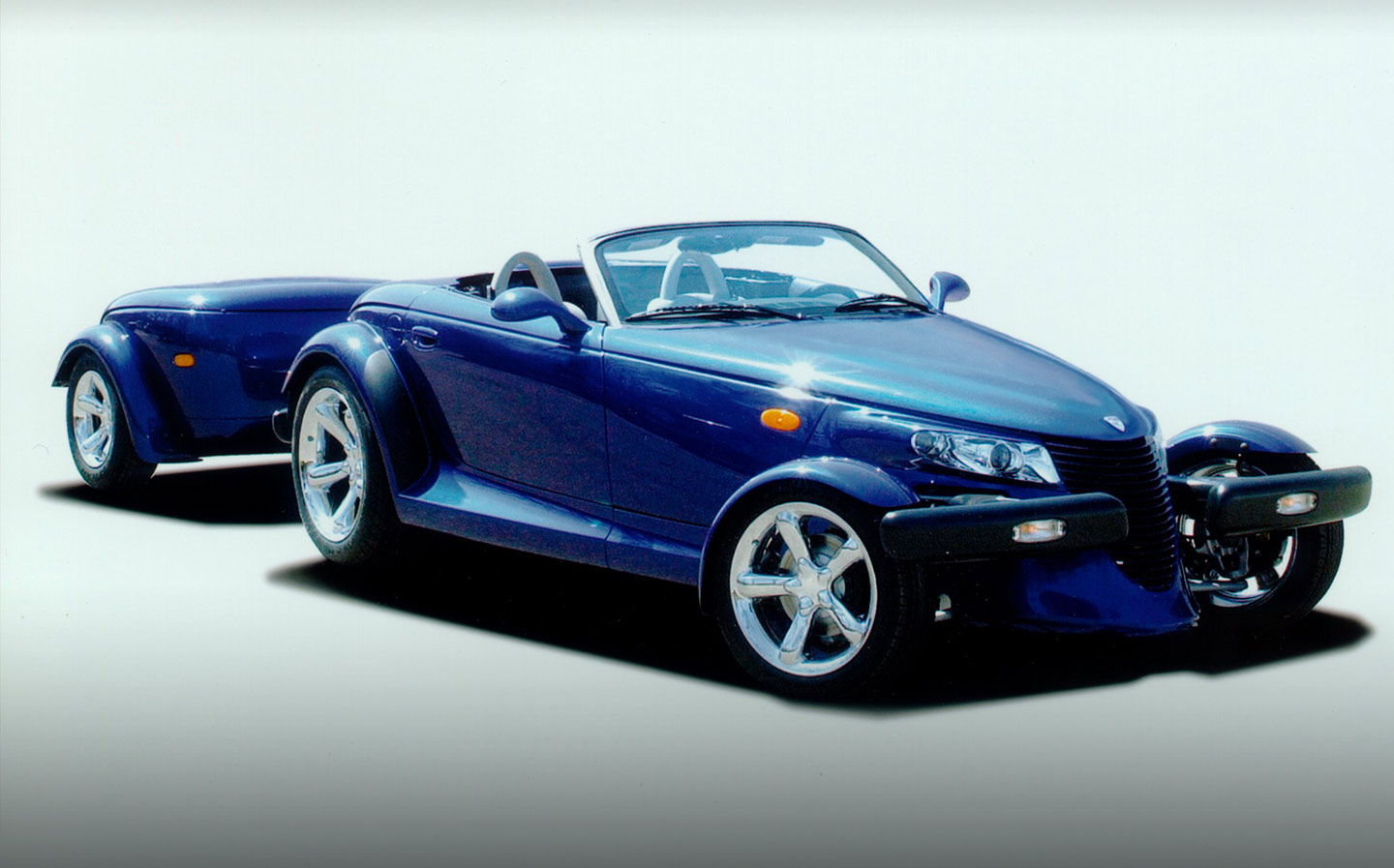
It harks back to the American hot rods of the 1950s but the Plymouth Prowler of the late 1990s just doesn’t quite work visually.
The optional trailer doesn’t help one bit. Not long after the Prowler’s release, the Plymouth brand died. Buy one of these today, though, and you’re looking at a cool £40,000.
11. Tesla Cybertruck

Only brainwashed Elon Musk acolytes believe the electric Cybertruck is a good-looking machine. Musk wanted it to be different and futuristic, but its drawn-with-ruler design looks like it came from the mind of a six-year-old.
What’s more, Tesla has found manufacturing such straight, angular panels almost impossible, and judging by photos of the early cars’ shut-lines and panel gaps, the problems still haven’t been resolved.
12. SsangYong Rodius

MPVs don’t have to be ugly — look at the Ford S-Max and other bland, inoffensive models like the Vauxhall Zafira and Ford Galaxy. Even in this none-too-desirable corner of the market, the SsangYong Rodius stands out like a thumb that’s been repeatedly whacked with a hammer.
The design by Ken Greenley, former head of the Royal College of Art and Design’s automotive design course, was intended to convey the essence of a luxury yacht — but we reckon it should have been torpedoed.
13. Rolls-Royce Camargue
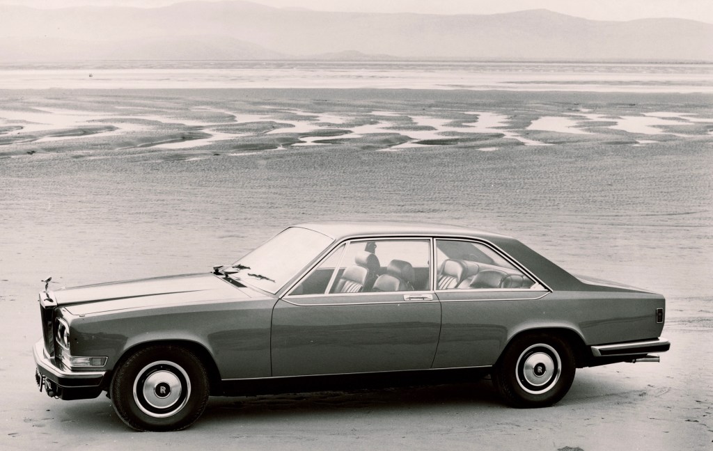
Rolls-Royce plus Pininfarina sounds like a winning combination; alas the resulting 1975 Rolls-Royce Camargue was not a car to be celebrated.
Based on Rolls-Royce’s Silver Shadow, the Camargue had none of the elegance of the Shadow or its Bentley T2 sibling. Instead, the Italian styling — influenced by the angular, minimalist trend of the era — tended to accentuate the worst elements of Rolls-Royce design to create a slab-fronted, slab-sided, straight-edged monstrosity that looked like a cluster of fridges welded together.
All that unabashed ugliness came at a staggering cost — £29,250, or £300,000 in today’s money.
14. Ford Scorpio Mk2
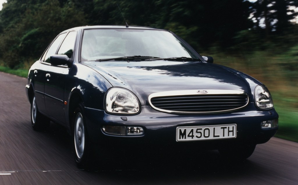
Despite not being a bad car, the second-gen Ford Scorpio’s “wide mouth frog” styling still looks as grotesque as it did when it was launched in 1994.
As well as the saloon, the Scorpio came as an estate, which, to be fair, didn’t make it look any worse; however, the Dutch royal family had a number of landaulette versions of the Scorpio commissioned, which somehow managed it.
15. Sin S1
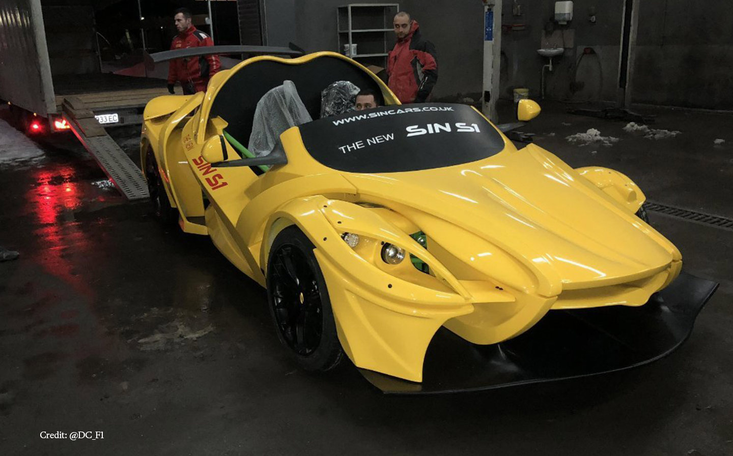
Sin Cars, a small company responsible for the much less aesthetically-challenging R1, created this follow-up called the S1. It’s a lightweight road and track car in the vein of a Radical SR3 or Ariel Atom, with a modular design that allows you to buy the chassis and then specify a number of components such as the drivetrain, interior and body design.
We’d go for literally any body other than this one and ask the person who came up with it to say multiple Hail Marys for his sins to car design.
16. Marcos Mantis
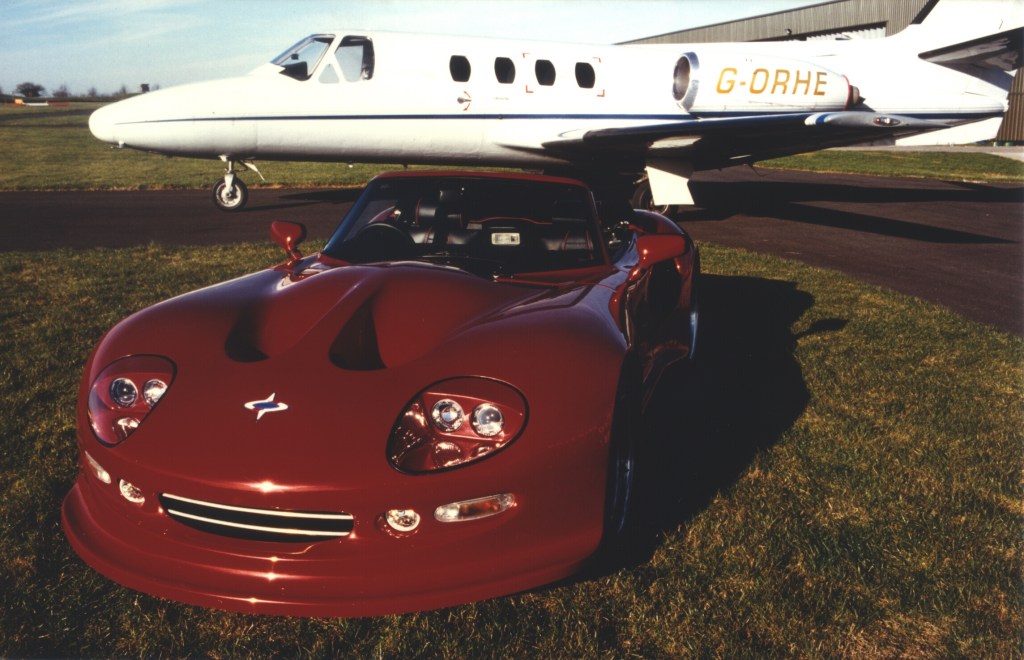
The aerodynamicist Frank Costin tended to eschew the design principle of “if it looks right, it is right”. But with a background in aircraft design and having worked on a number of successful racing cars, Costin also knew that some of the most aerodynamic shapes weren’t necessarily the prettiest.
Probably the zenith of this design philosophy was the 1968 Marcos Mantis, a fast 2+2 model built in Bradford-on-Avon in Wiltshire, though latterly available in kit form. A low-slung wedge, it was simply too ugly to appeal to the “young executive market” for which it was intended.
17. Shamrock
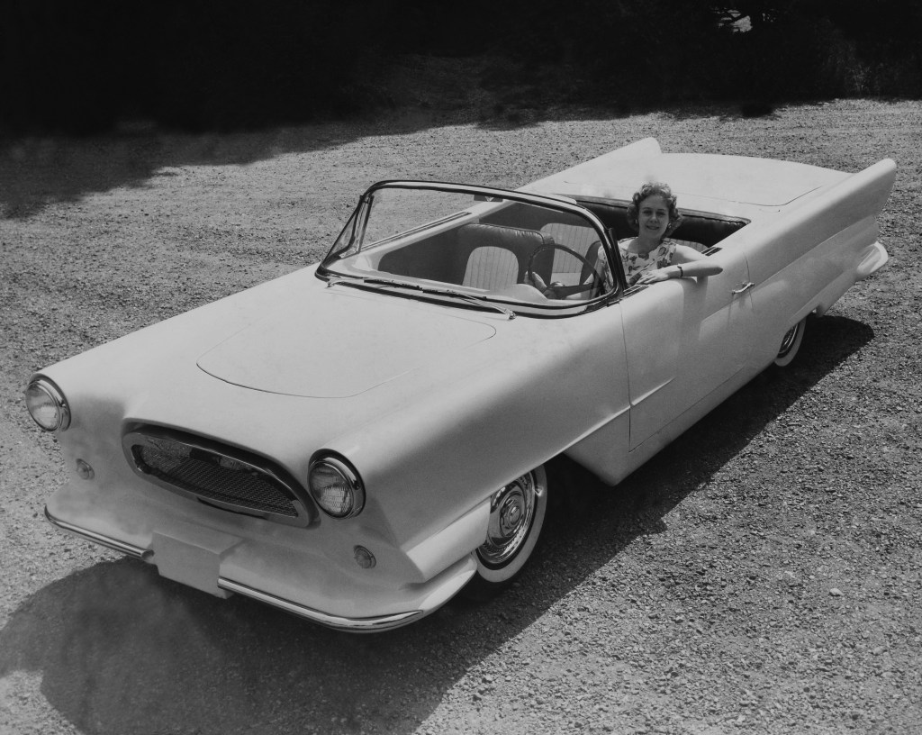
The Shamrock had some of the elements of a promising idea: use cheap Irish labour to build a car with contemporary styling and well-proven mechanicals to serve the then-growing US market for small second cars. After all, the British-built Nash Metropolitan was hit, so why not this?
It might have worked had the Shamrock not been incredibly ugly, its fibreglass body aping bigger American cars of the late fifties, but shrunken to fit its Austin Cambridge underpinnings, making it look like a parade float.
To be fair to the Emerald Isle, the idea was the brainchild of two Americans and, once the company folded after only building around ten cars, the surplus parts were deservedly dumped in a lake.
18. Bond Minicar
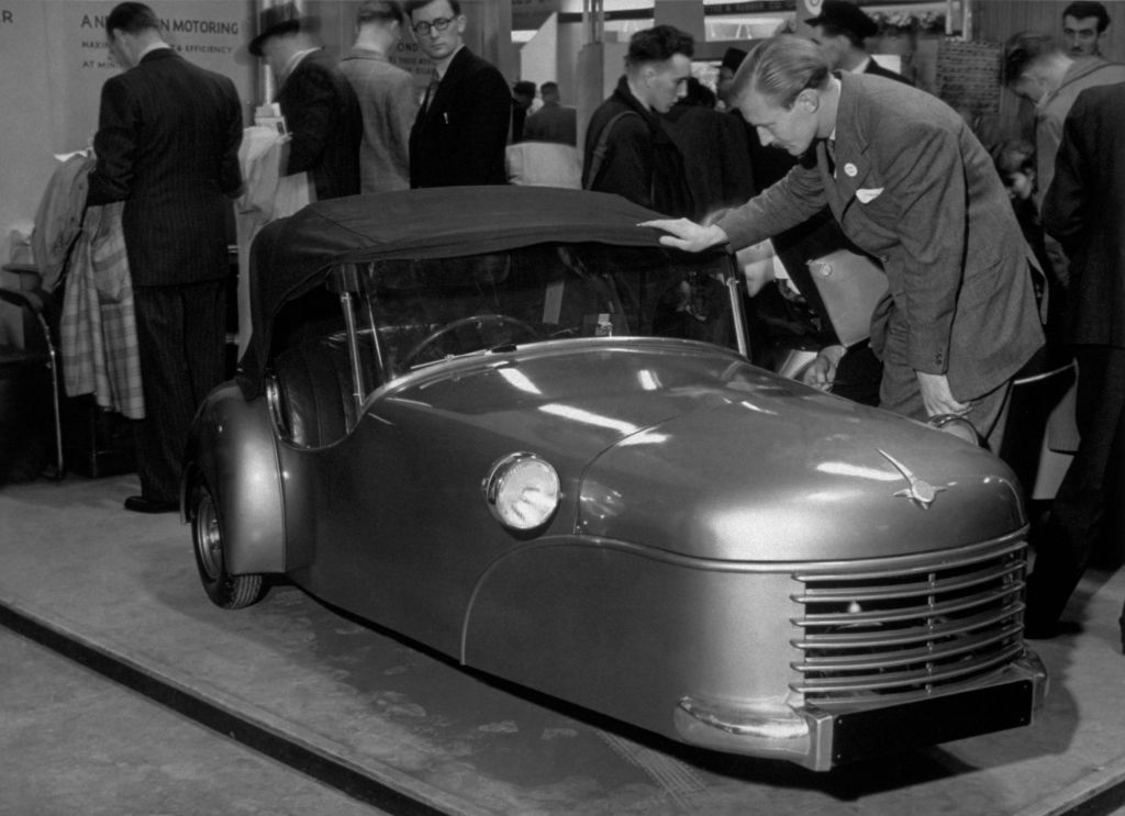
Most famous for creating the cheese-shaped Bond Bug in the 1970s, Sharp’s Commercials in Lancashire started building three-wheelers after the war to cater to an impoverished British population crying out for mobility and cheap motor vehicles. Three-wheelers were one answer to that demand and the Bond Minicar was one of the most popular.
These sad-looking rickety vehicles went through several generations, none that was much better than the last, and all were powered by smoky little two-stroke engines.
Although the Minicar lasted until 1966, cars such as BMC’s Mini and an improving economy heralded the death knell for three-wheelers’ popularity.
19. Saab 9-5 (2006 facelift)
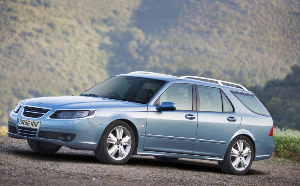
By 2006, the Saab 9-5, though still a fine and good-looking car, was really getting on a bit and needed a styling update to keep it fresh. That didn’t go so well.
The changes were thankfully mostly confined to the front end, but unfortunately this is where they made the greatest impact. A headlight redesign with new chrome headlamp surrounds made it look like someone had overdone it with a roll of fake chrome trim from Halfords, leading to Jeremy Clarkson memorably describing the facelifted 9-5 as looking like it was wearing a pair of Dame Edna’s spectacles.
20. Triumph Mayflower
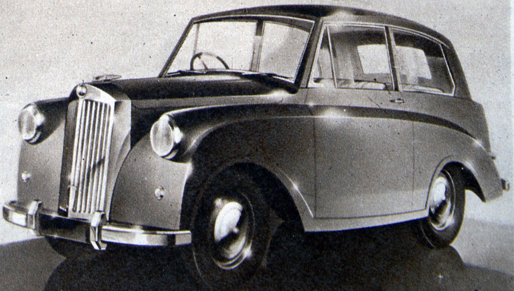
For post-war British car companies, it was a case of “export or die”. The Mayflower was Standard-Triumph’s attempt to sell English-style limousines to the Americans under the mistaken assumption that Americans would want a slow, shrunken version of a Daimler.
The Mayflower was as unappealing and dull as the post-war, ration-hungry time in which it was built. Intended for export, it found few buyers either at home or abroad.
21. BMW i7
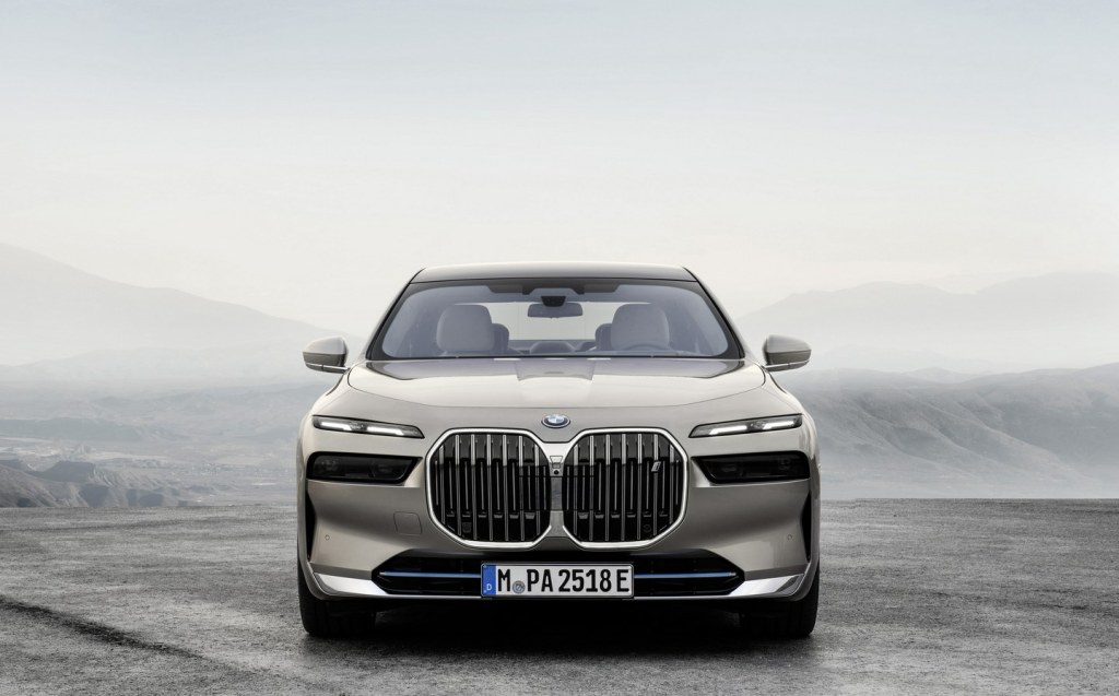
The BMW i7 has a lot of incredibly good things going for it: a pure-electric powertrain with good range and strong performance; an exquisitely appointed interior; a comfortable ride. And actually, more than 90 per cent of the styling is quite handsome. It’s really a shame then that from the edge of the front wheels forwards, it’s absolutely grotesque.
The grille is obnoxiously huge and the positioning of the number plate below the double kidneys does nothing the break up the sheer expanse of grille. The double-stacked headlights are aesthetically questionable, too. Well, at least nobody can accuse it of being forgettable.
22. Lincoln MKT
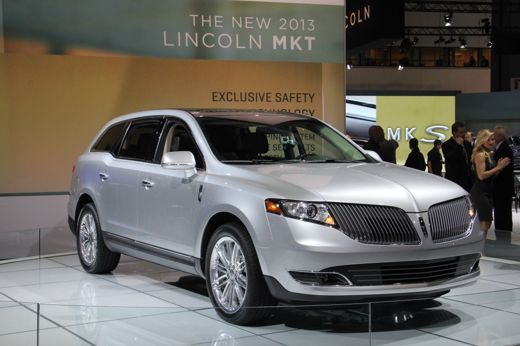
Think new BMWs have a monopoly on massive grilles? The Lincoln MKT was doing it back in 2010 with its uninspired MKT model that was seemingly more grille than car.
Looking at the MKT’s rear gives one a better idea of what the designers were going for — 1940s styling akin to that of the Chrysler PT Cruiser, another car often slammed as deplorably ugly. Whereas the PT Cruiser was doing its thing at a time when retro styling was all the rage, in 2010, the MKT really had no excuse.
23. Mitsuoka Galue
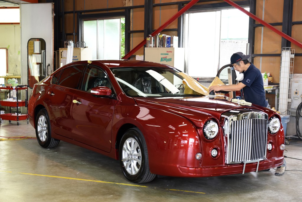
There are few more individualistic car companies in the world than Mitsuoka, whose stock in trade generally sees the firm grafting olde worlde front and rear ends onto modern cars.
Some of these attempts are more aesthetically successful than others, but one of the most offensive has to be the Mitsuoka Galue, based on the Japan-only Nissan Teana, but featuring styling reminiscent of Bentleys from the fifties.
No generation of Galue (yes, unbelievably there’s more than one) is particularly a looker, but the most egregious has to be the third-gen 2010 model with its laughably long front overhang.
Related articles
- After reading about the ugliest cars ever, you might be interested to read about the most ridiculous car names ever
- Jeremy Clarkson has driven the Land Rover Defender 130, and he’s not a fan of its looks
- ‘Ugly’ electric car charging points get a makeover from children
Latest articles
- Should I buy a diesel car in 2025?
- F1 2025 calendar and race reports: The new Formula One season as it happens
- Zeekr 7X AWD 2025 review: A fast, spacious and high tech premium SUV — but someone call the chassis chief
- Denza Z9GT 2025 review: Flawed but sleek 1,062bhp shooting brake from BYD’s luxury arm
- Extended test: 2024 Renault Scenic E-Tech review
- Best-selling cars 2025: The UK’s ten most popular models of the year so far
- Audi A6 Avant 2025 review: Trusty executive estate ticks expected boxes, and there’s still a diesel option
- Keir Starmer eases pressure on carmakers to sell EVs in response to ‘global economic headwinds’
- Ferrari 12Cilindri Spider review: Heady blend of traditional and futuristic becomes even more intoxicating after lid is removed


